Polarr Icon Set
Polarr Icon Set
Icons, as well as images, communicate far more than words. They are volumetric and multidimensional aspects of human communication, representing a sophisticated yet minimalist, multi-layered visual language.
By combining shapes and forms from our environment, these symbols dissolve into a broad spectrum of signs, without which modern society would be unimaginable.
Icons are a timeless language of design.
Polarr Photo Editor is rich in features and packed with interactive elements, tools, and professional photographic terminology. In contrast, the interface design is distilled to only the essential functional elements, ensuring clarity through the use of icons. These icons act as interactive links between the user’s intention and the application’s features. By reducing visual saturation and cognitive noise, the interface prioritizes clarity and seamlessly connects human intention with software functionality.
Polarr Photo Editor is rich in options and is thus packed with interactive elements, tools, and various terms, therefore the subtlety of UI components is crucial. For this reason, UI is made up of simple but responsive elements combined with stylized minimalist icons. Icons, in this case, play the role of interactive links between the user and the application, they are the language through which we communicate with
the software.
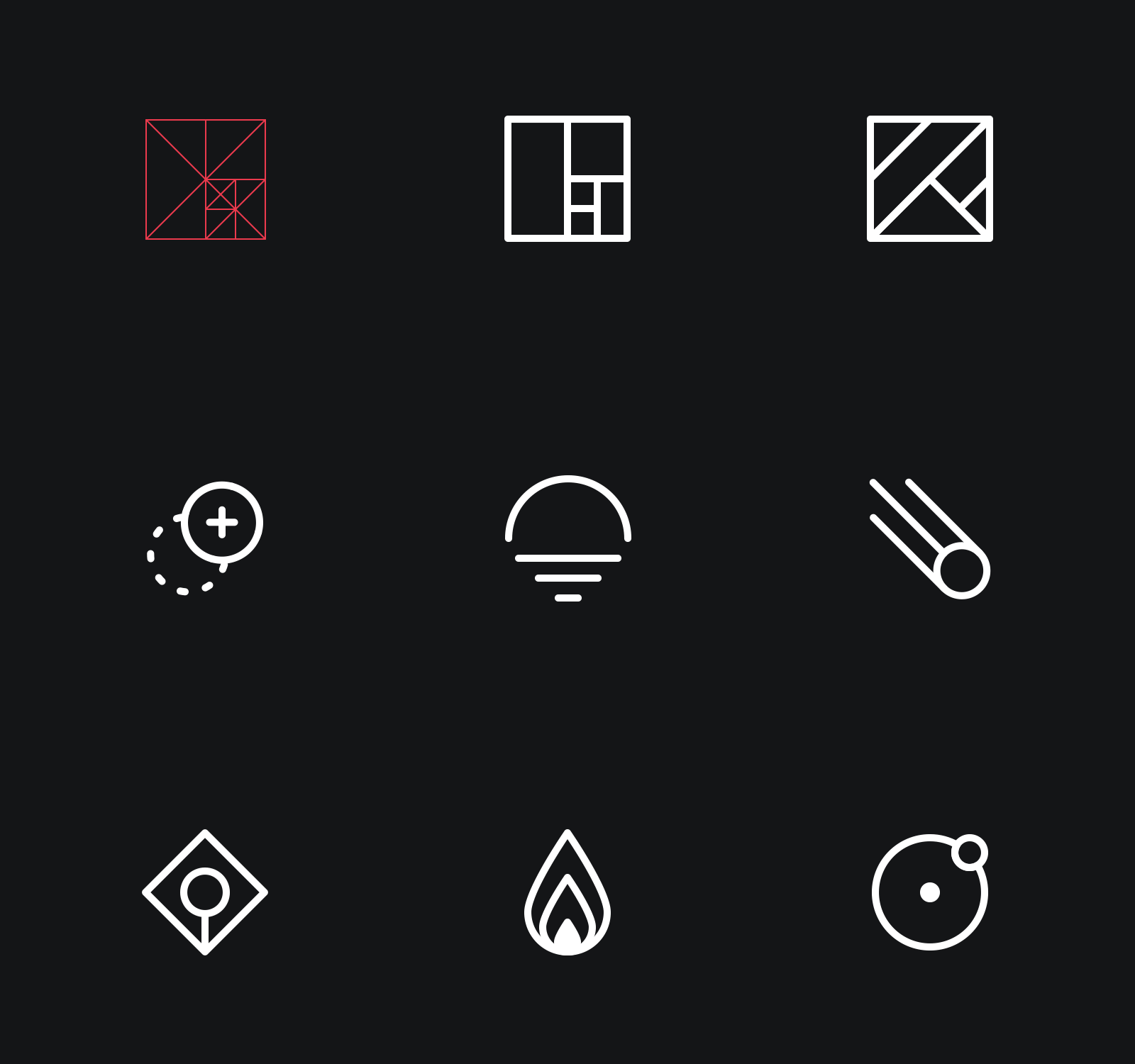
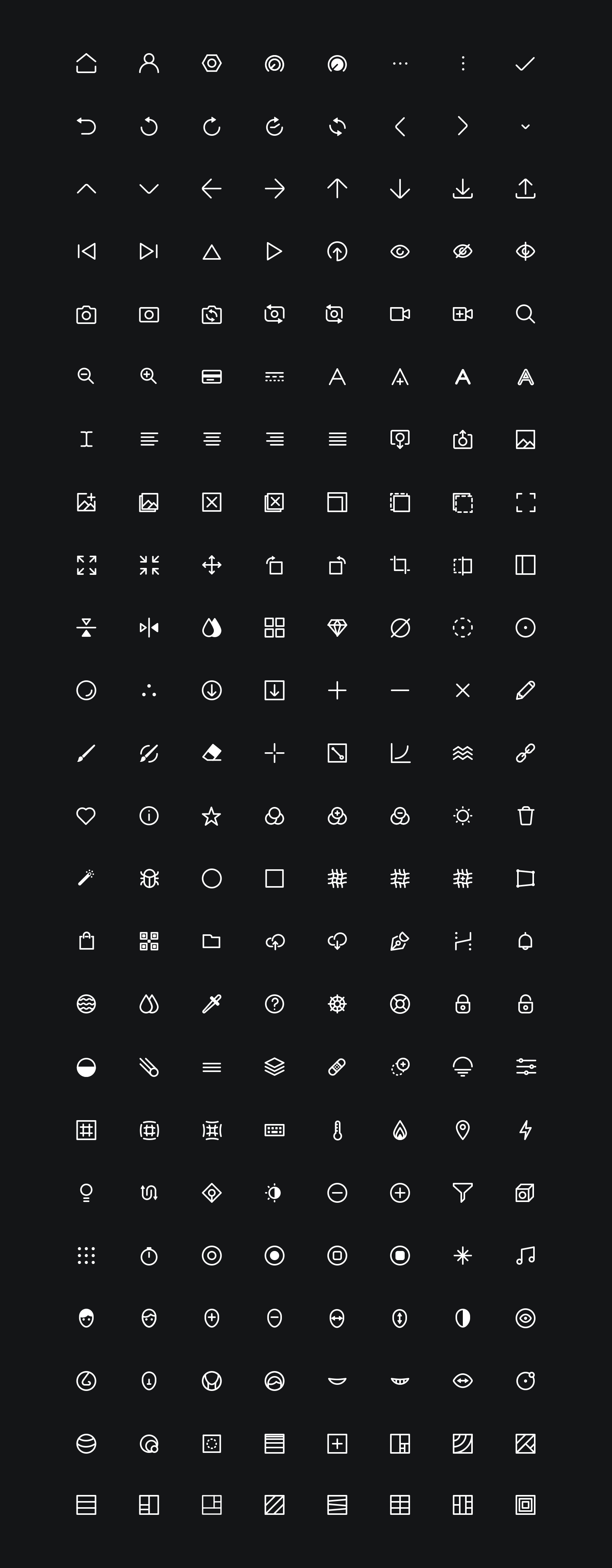
In order to achieve better visual harmony and consistency with the circular visual identity of the company, I used slightly curved edges as a contrast to the strict interfaces of the user interface and rectangular photo formats and aspect ratio of 24px. The result of two months of research and work was a redesigned set of 200+ pixel-perfect icons with a dingbat icon font.
In order to achieve better visual harmony and consistency with the circular visual identity of the company, I used slightly curved edges as a contrast to the strict interfaces of the user interface and rectangular photo formats and aspect ratio of 24px. The result of two-month research and work was a redesigned set of 200+ pixel-perfect icons with a dingbat icon font.
