Gg Bihac
Gg Bihac
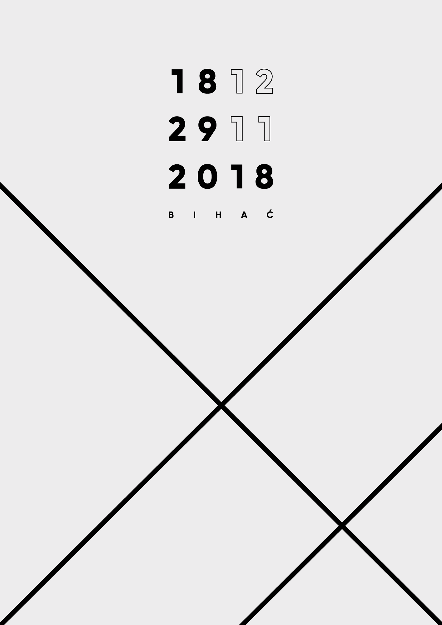
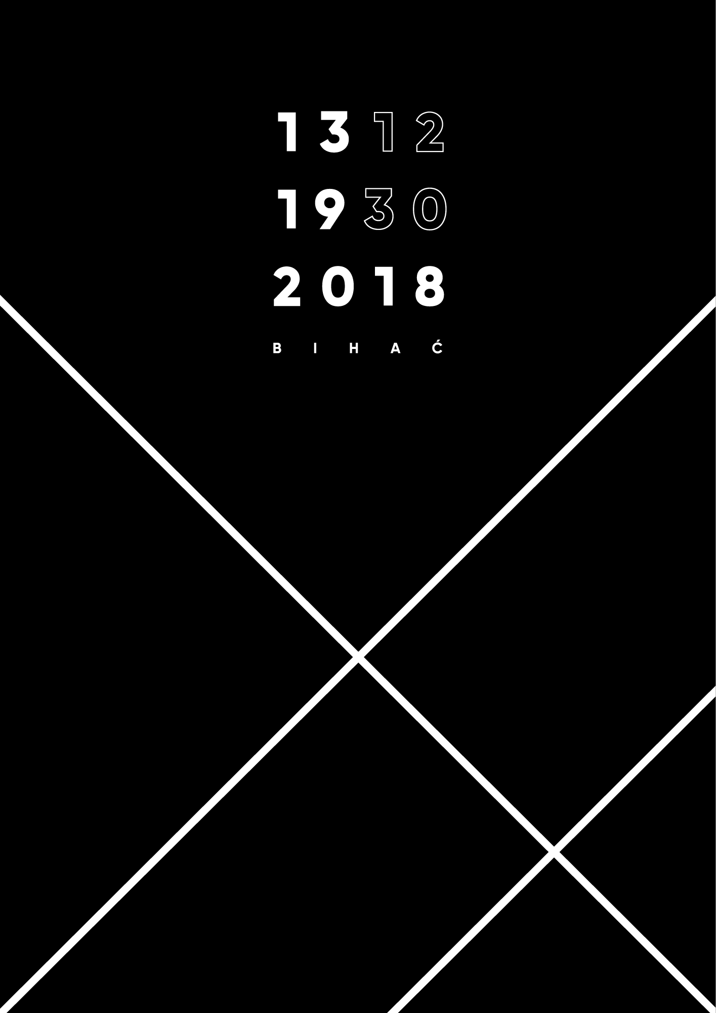
Client: Bihac City Gallery (2018)
Role: Designer, Art Director
Live: www.ggbihac.com
In celebration of the twentieth anniversary of the Bihac City Gallery (one of the most significant art and cultural institutions in western Bosnia and Herzegovina), I was invited to develop a new visual identity and monograph.

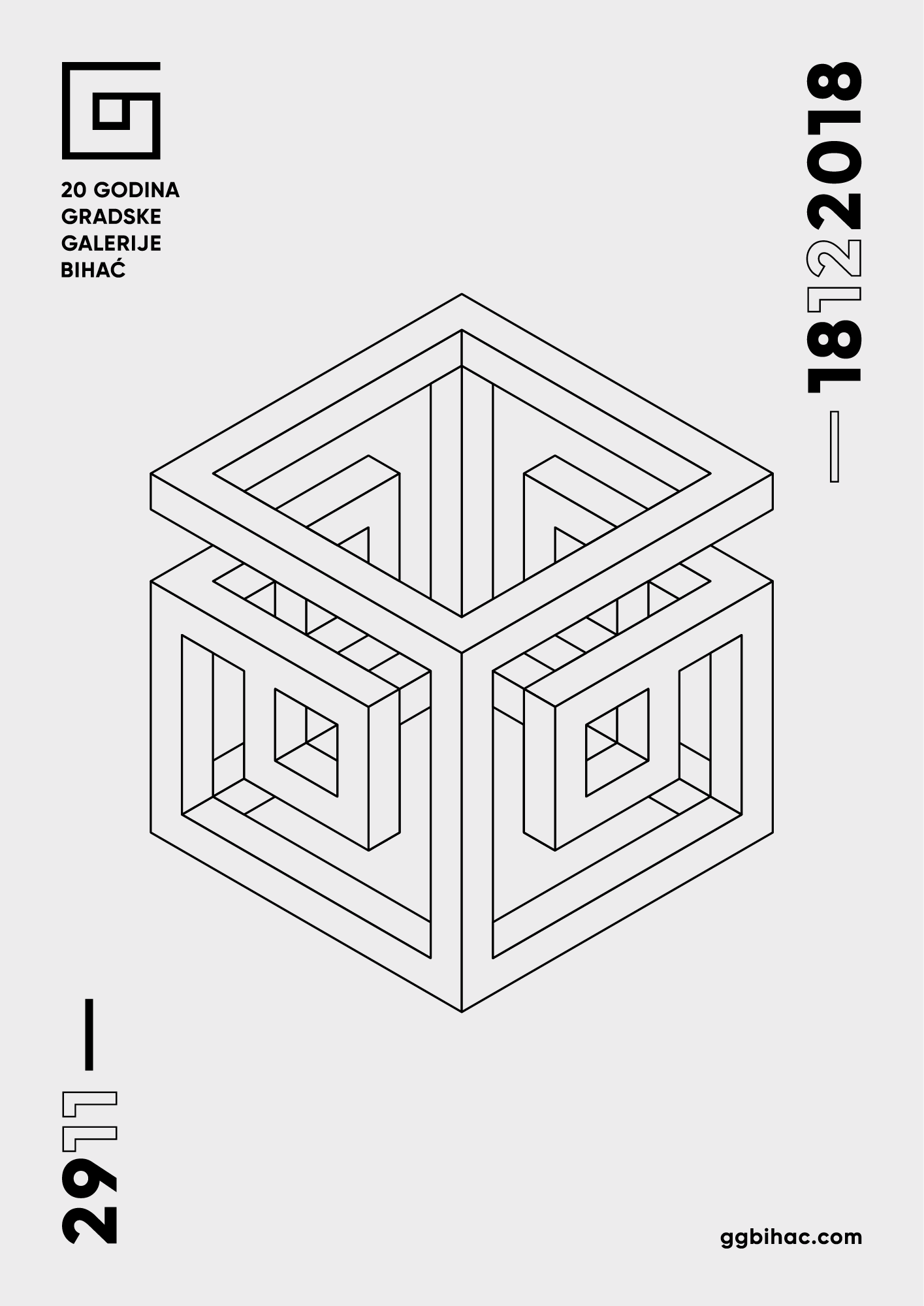
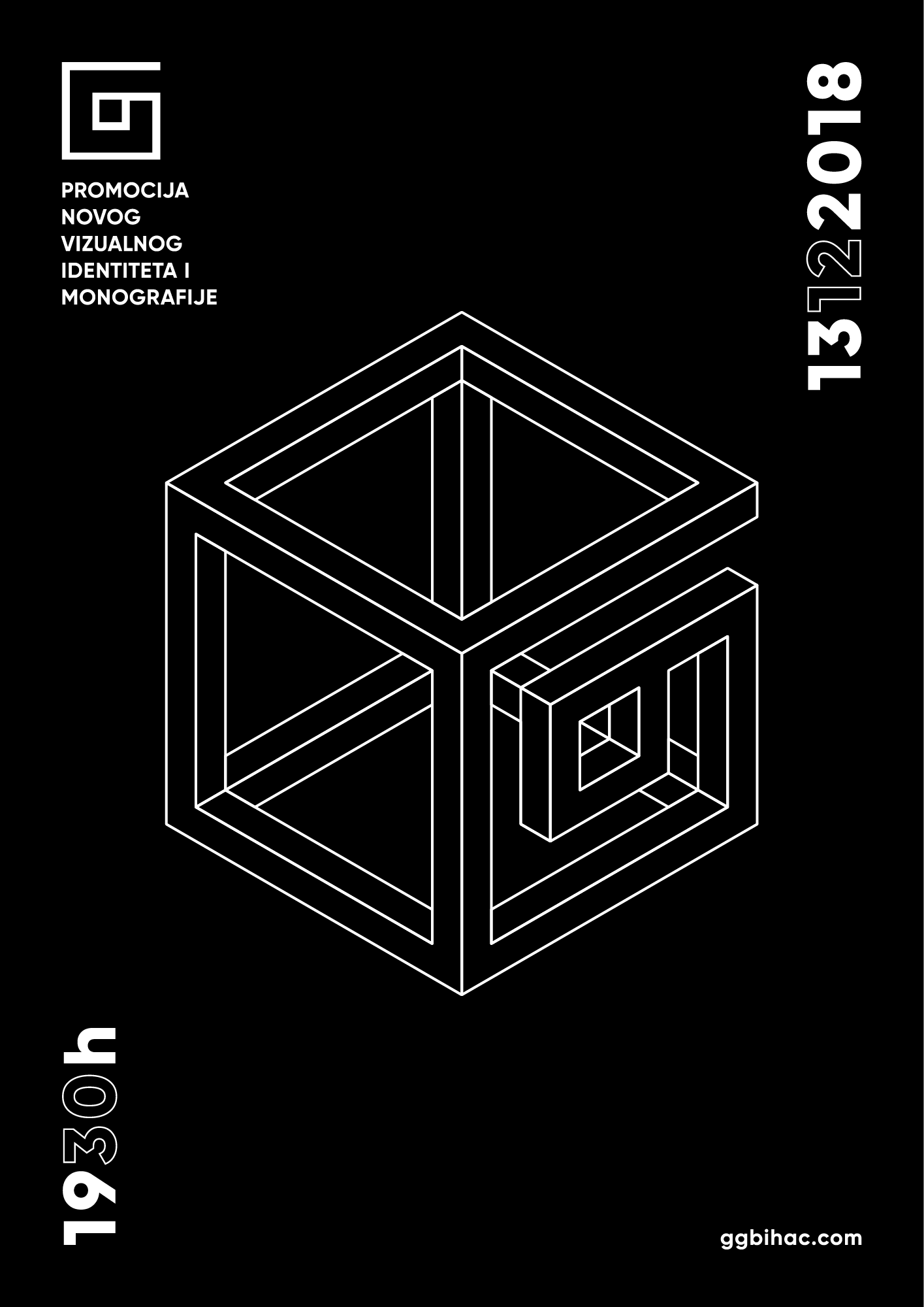
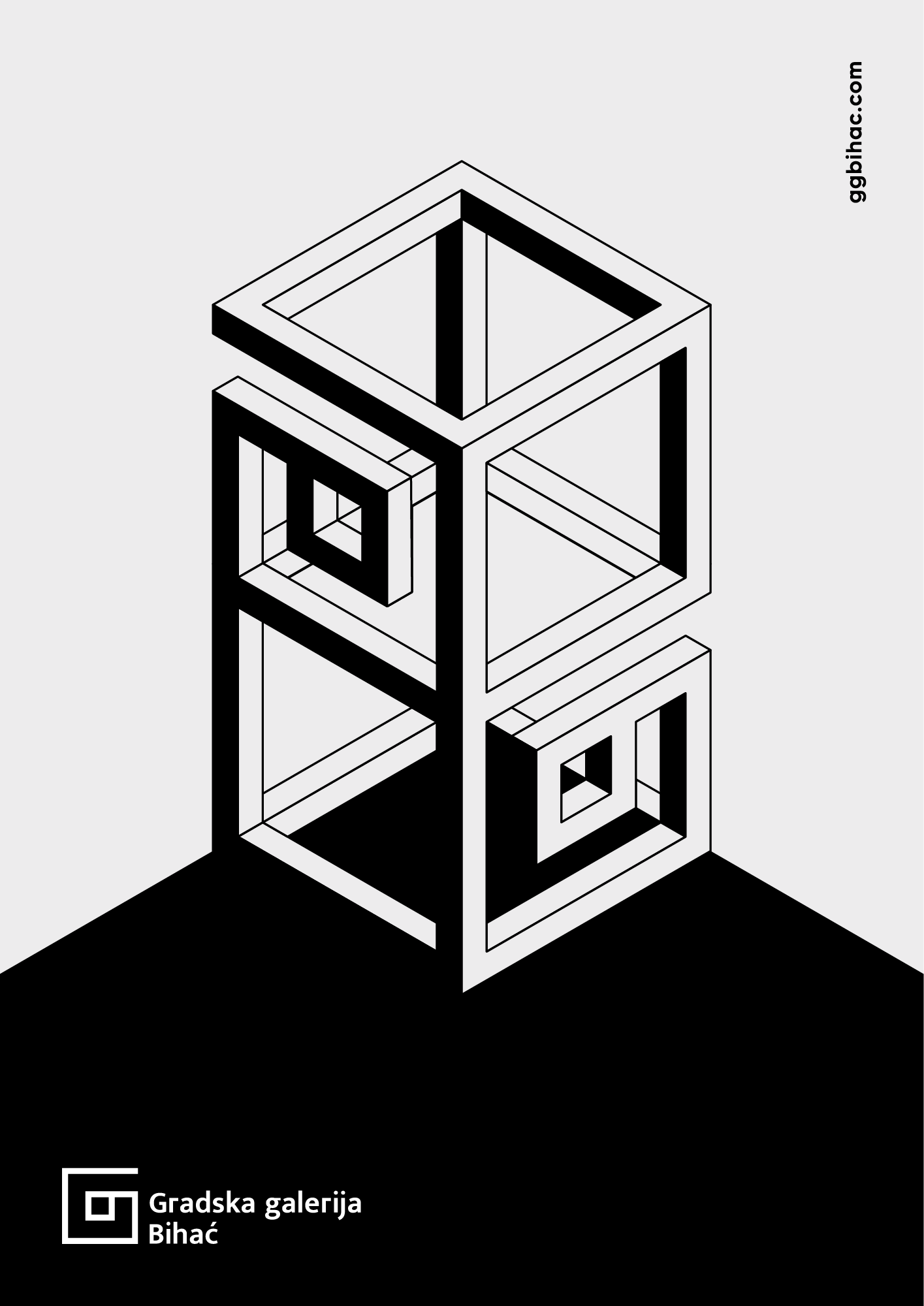
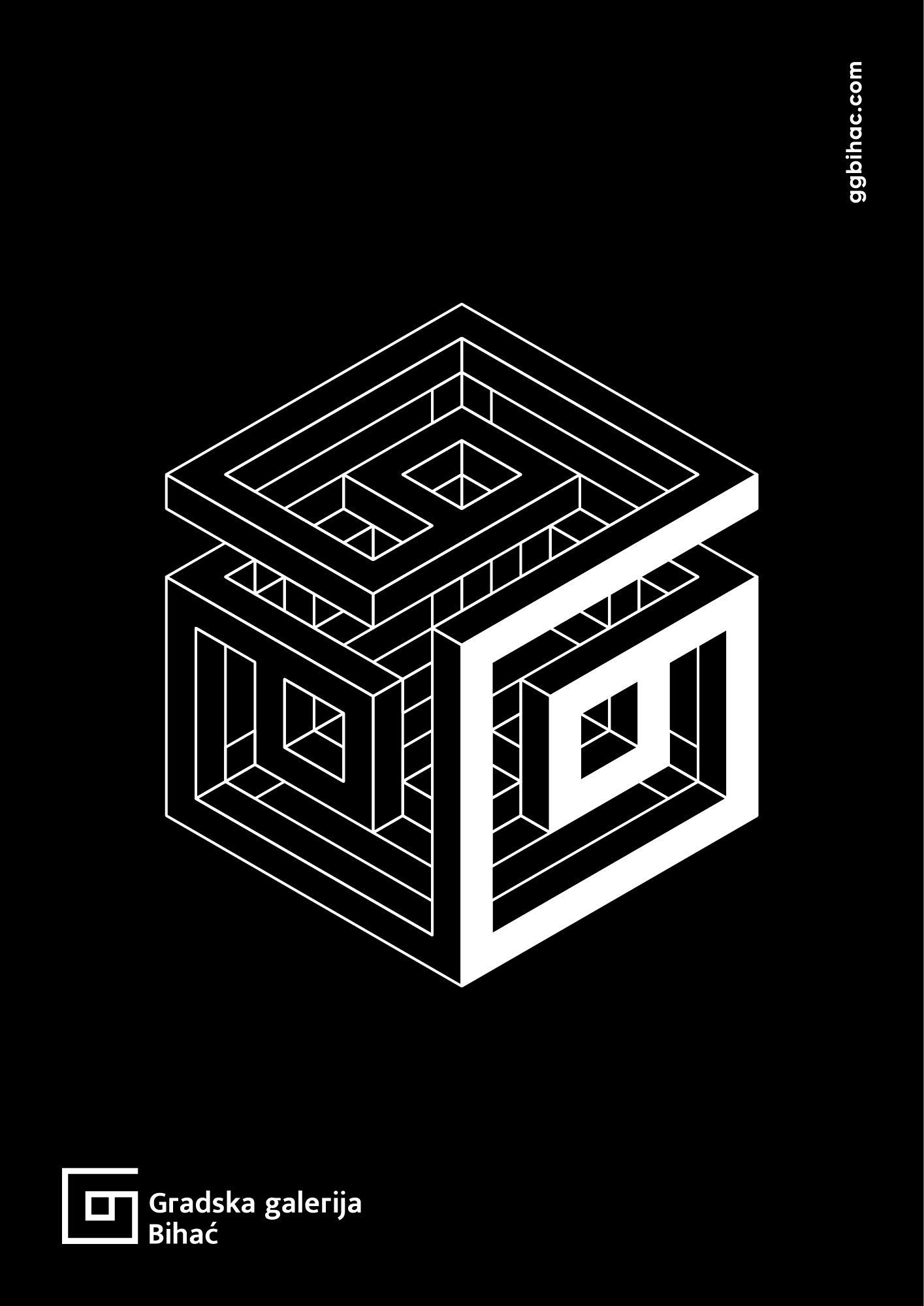
Branding a public institution whose name does not explicitly reference a notable individual, architectural feature, or historical event posed a particular challenge in defining a symbolic logo. To guide the creative process, I looked into the experiential characteristics of the audience as well as the typographic basis of the original design.
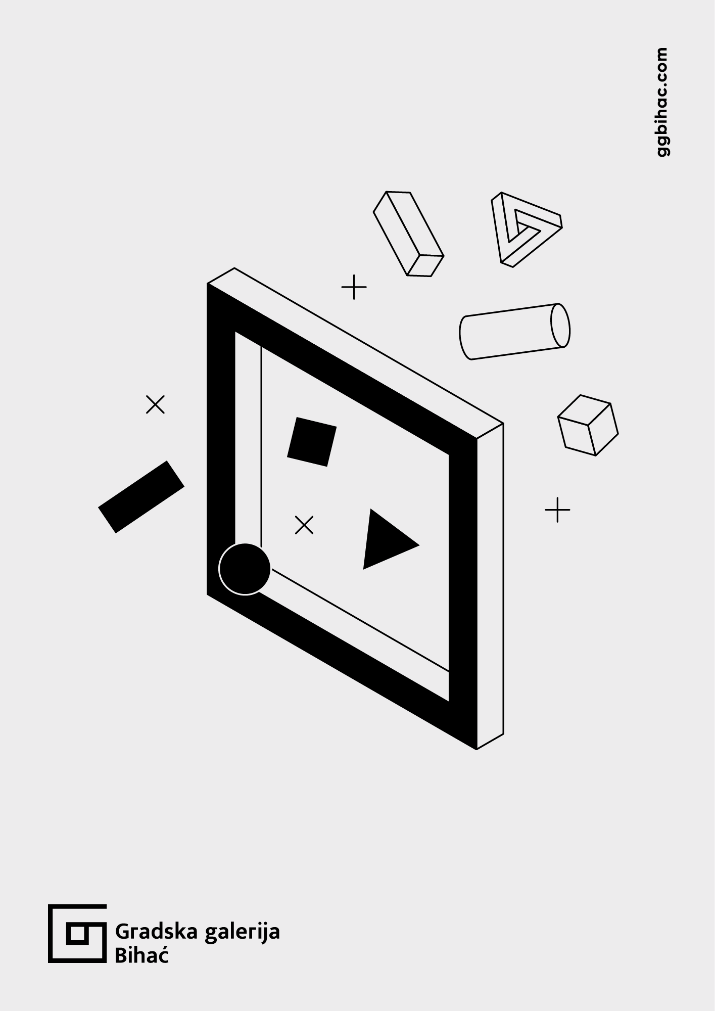
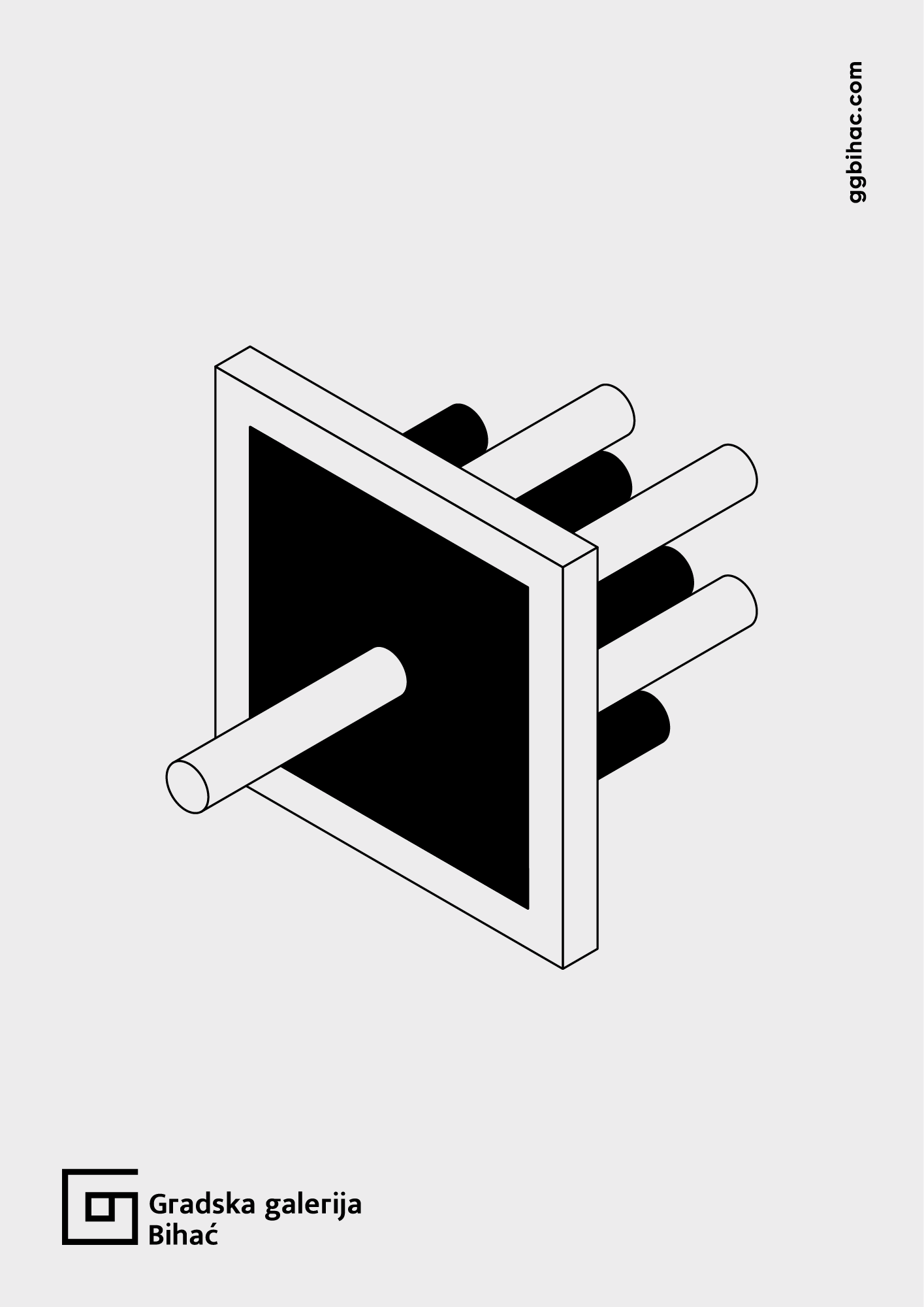
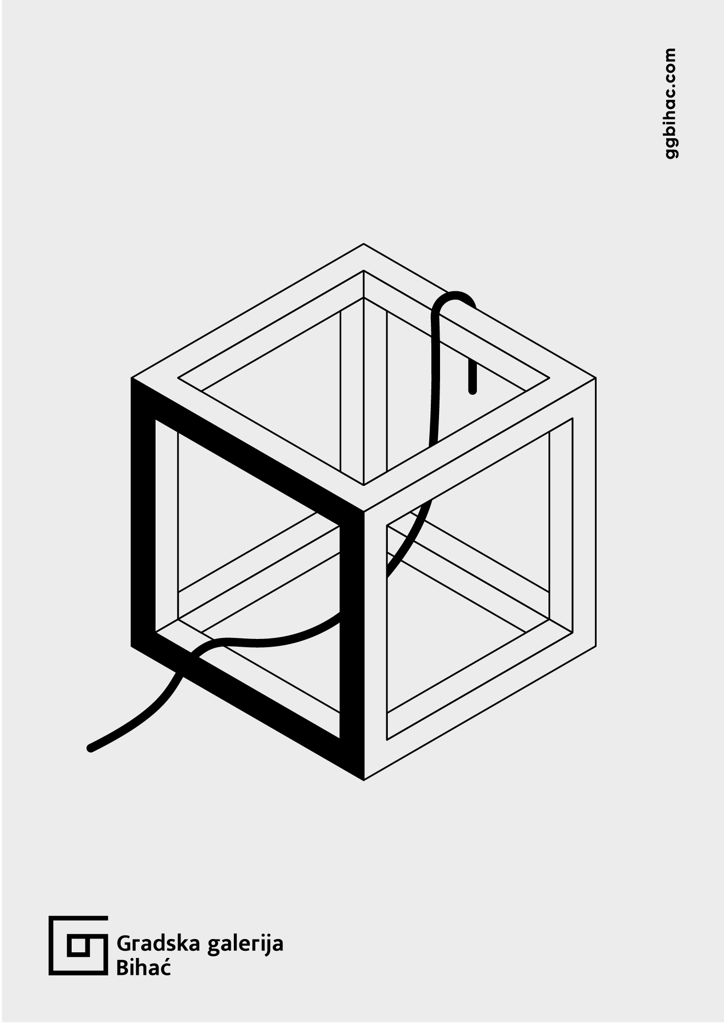
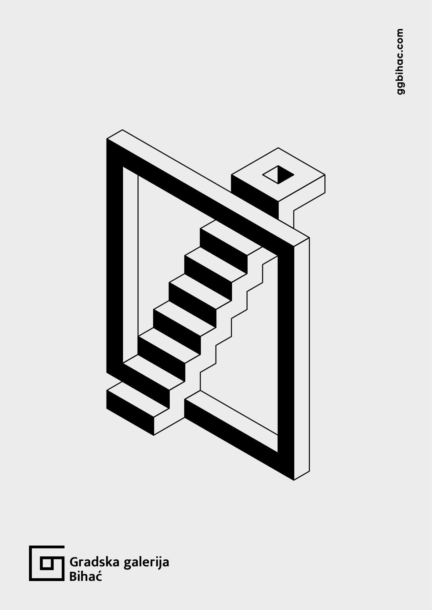
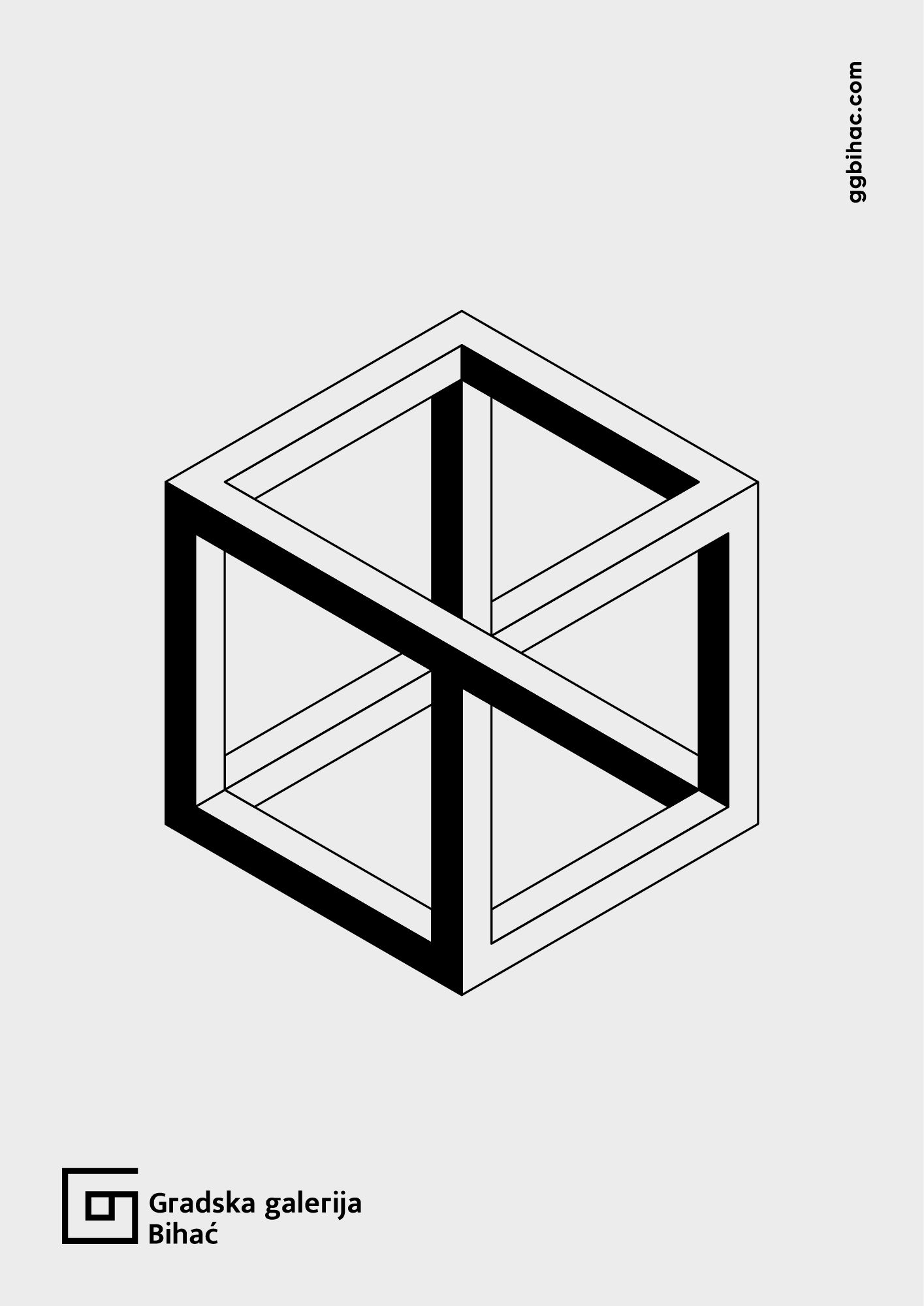
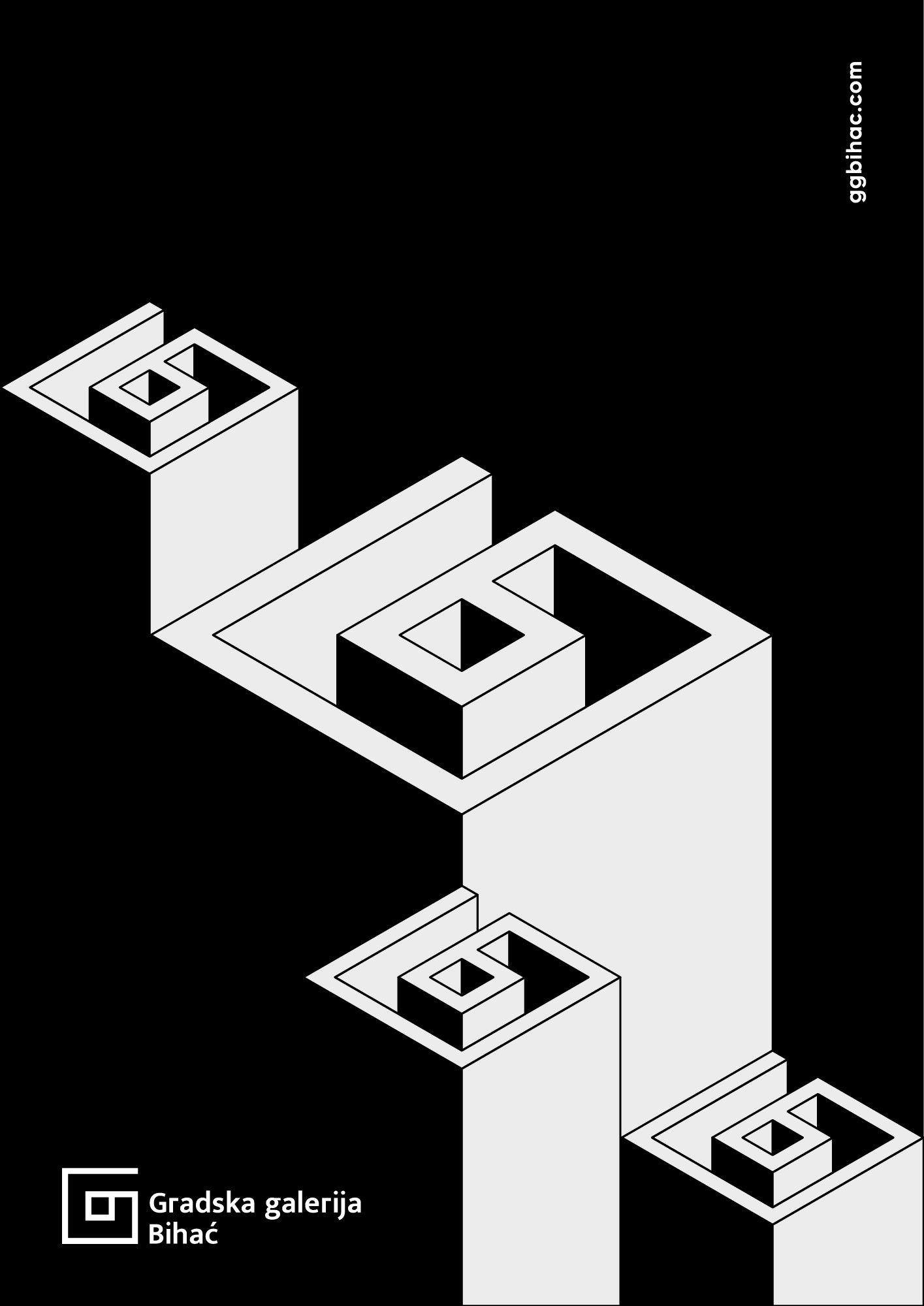
Thus, the multidisciplinary nature of the Gallery became my starting point. The Bihac City Gallery is not only an exhibition space but also a hub for various art and cultural events, and a catalyst for regional critical discourse. From these insights, space, form, and energy emerged as the key elements representing its broad scope.
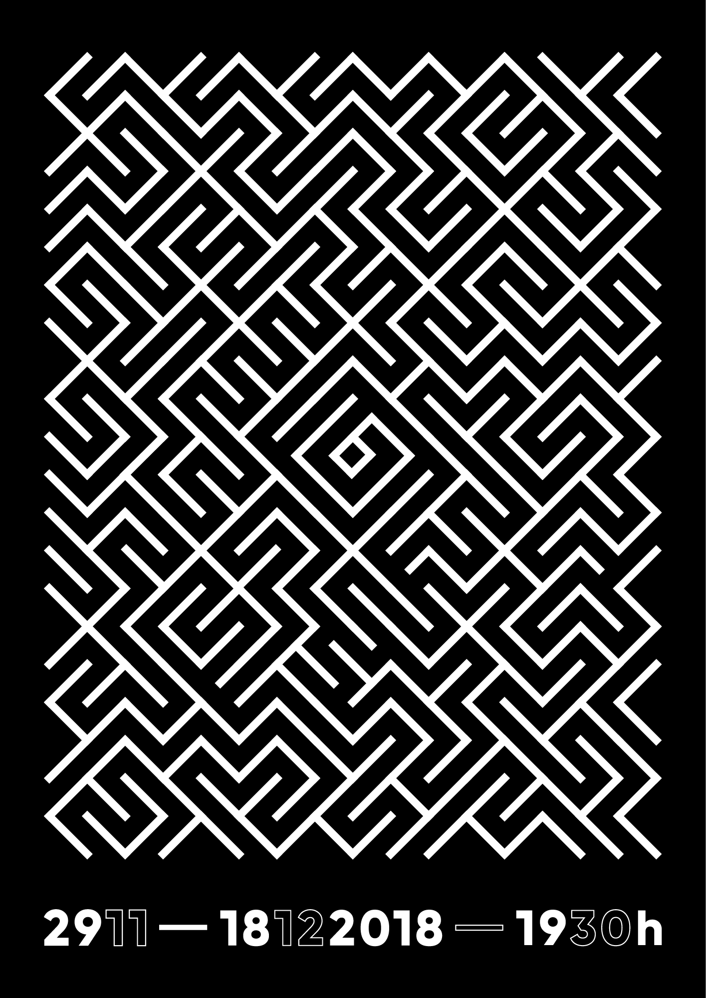
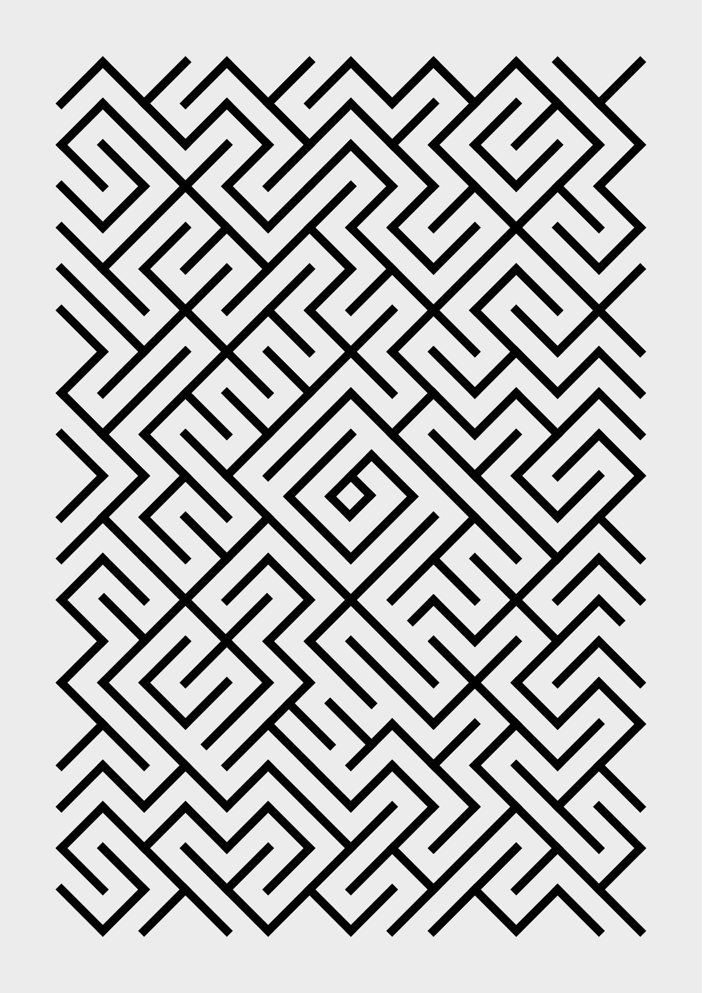
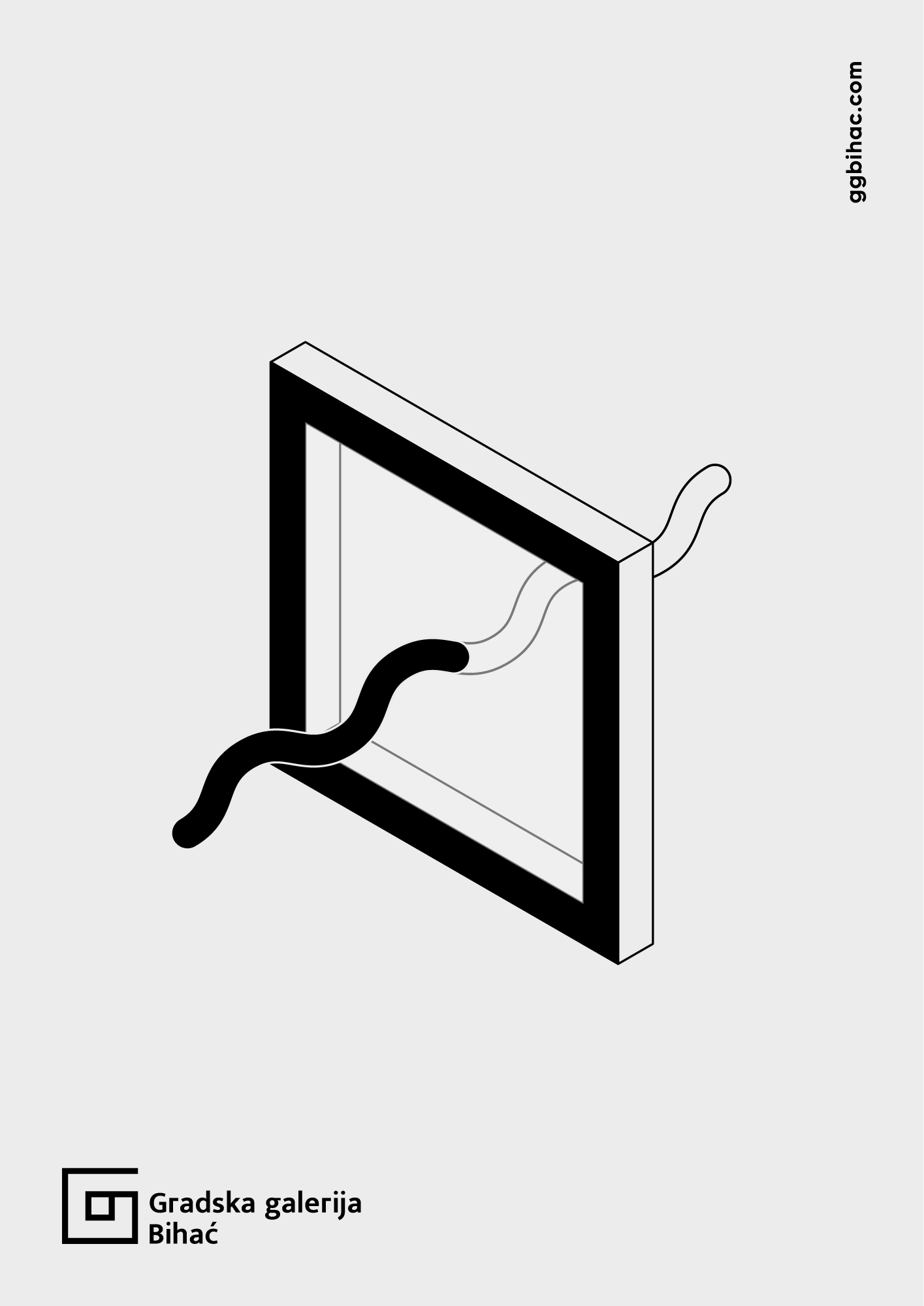
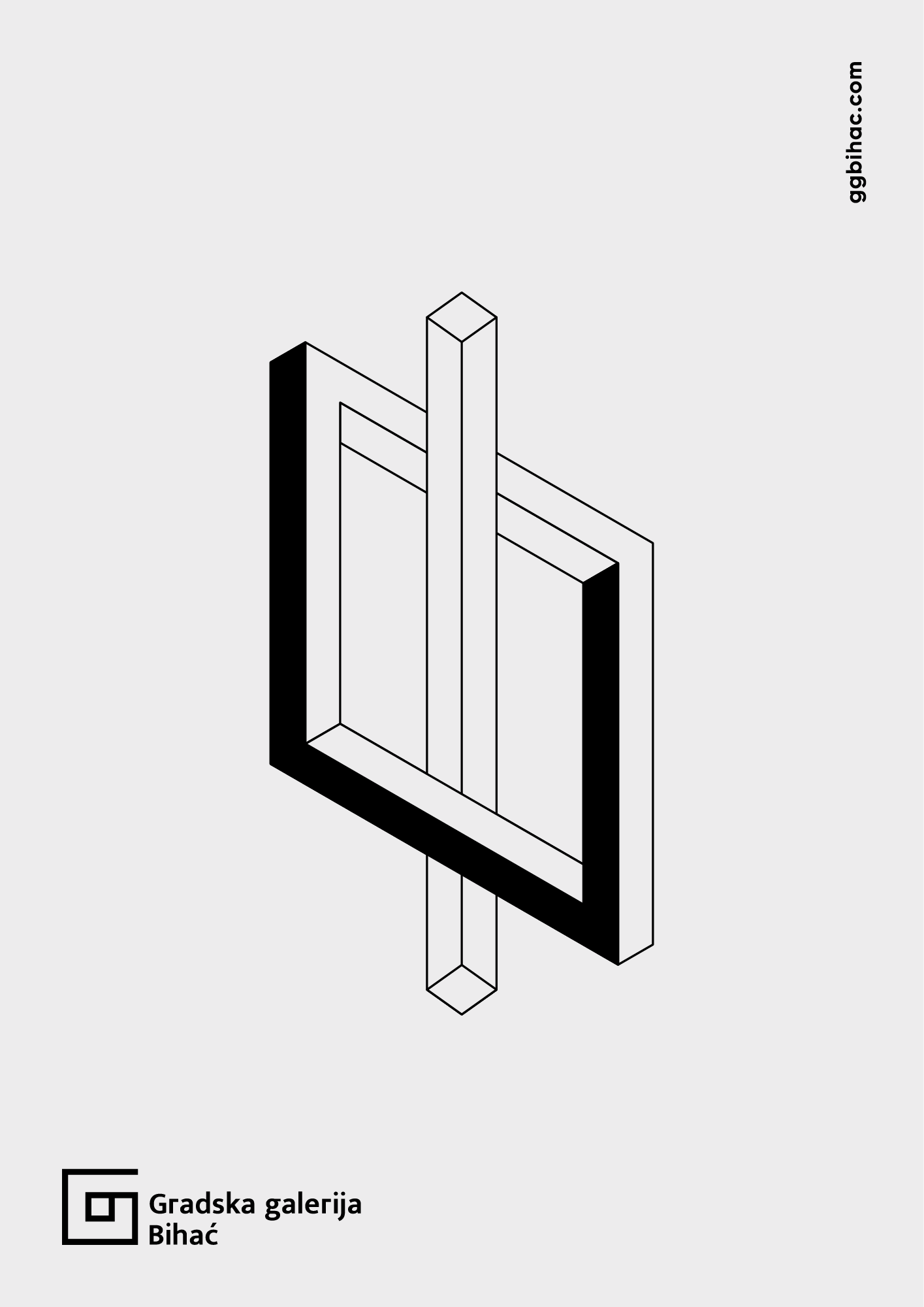
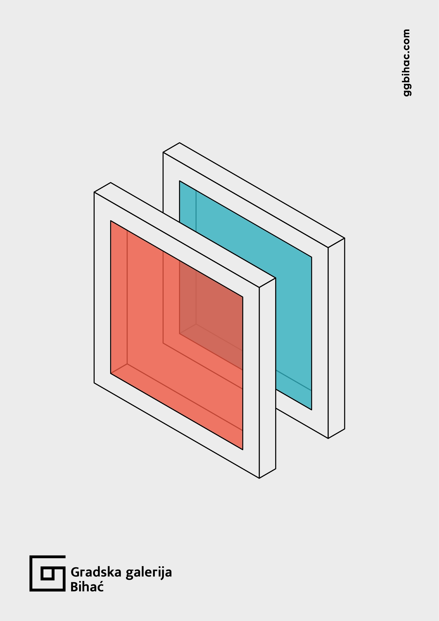
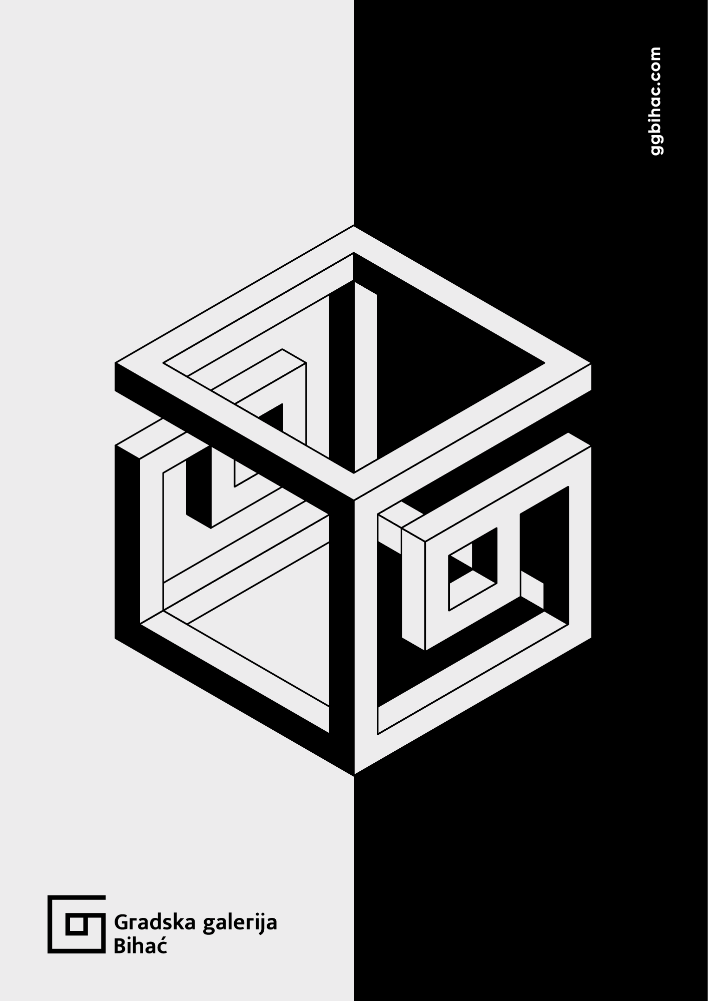
Since the original logo featured two opposing letters “G” (short for “Gradska Galerija,” Bosnian for “City Gallery”), I took that as the basis for further design iterations, maintaining a typographic foundation while simplifying and visually highlighting these core ideas. By merging an uppercase and a lowercase G, a labyrinth-like symbol took shape; its center suggests a frame (a universal signifier of diverse artistic disciplines), while the open square hints at the idea of an open path.
Through additional exploration of geometric forms, graphic design, and illustration, I developed a cohesive set of graphic patterns and visual relationships. This process led to a refined typographic solution that unites the logo’s multipurpose symbolism with the institution’s dynamic, multidisciplinary identity.